

Orla Pituaçu
Categories: Branding · Brand Strategy - Verbal and Visual Expression
[PT/BR]
O desafio
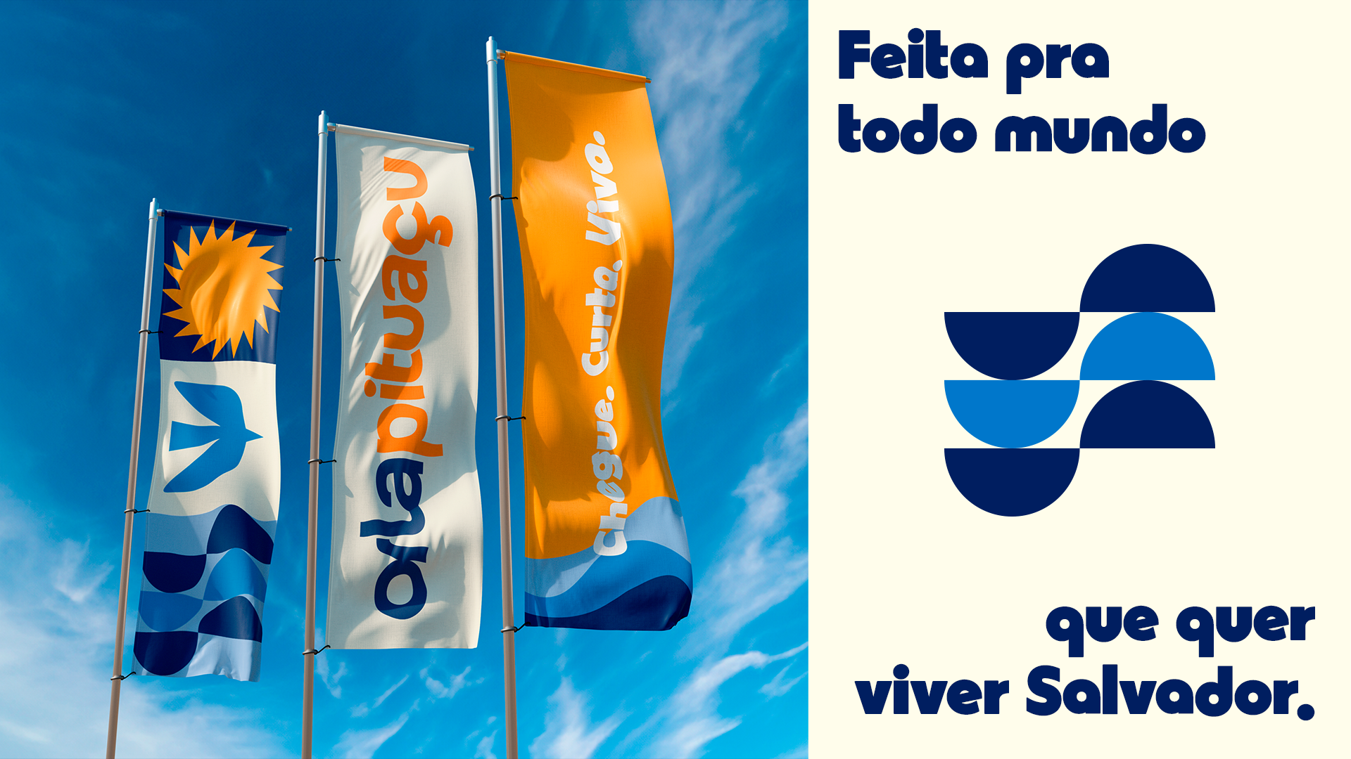
A nova Orla Pituaçu surge em um momento de transformação de Salvador. Mais gente vivendo a cidade, ocupando os espaços públicos e buscando qualidade de vida ao ar livre. O desafio era traduzir esse novo comportamento em uma marca viva, democrática e inspiradora, capaz de despertar orgulho nos soteropolitanos e reposicionar a orla como um símbolo da cidade bem cuidada e vibrante.
[ENG]
The Challenge
The new Orla Pituaçu emerges at a time of transformation in Salvador. More people are embracing the city, occupying public spaces, and seeking a better quality of life outdoors. The challenge was to translate this new behavior into a vibrant, democratic, and inspiring brand—one capable of fostering pride among Salvador’s residents and repositioning the waterfront as a symbol of a well-cared-for, dynamic city.
[PT/BR]
A estratégia
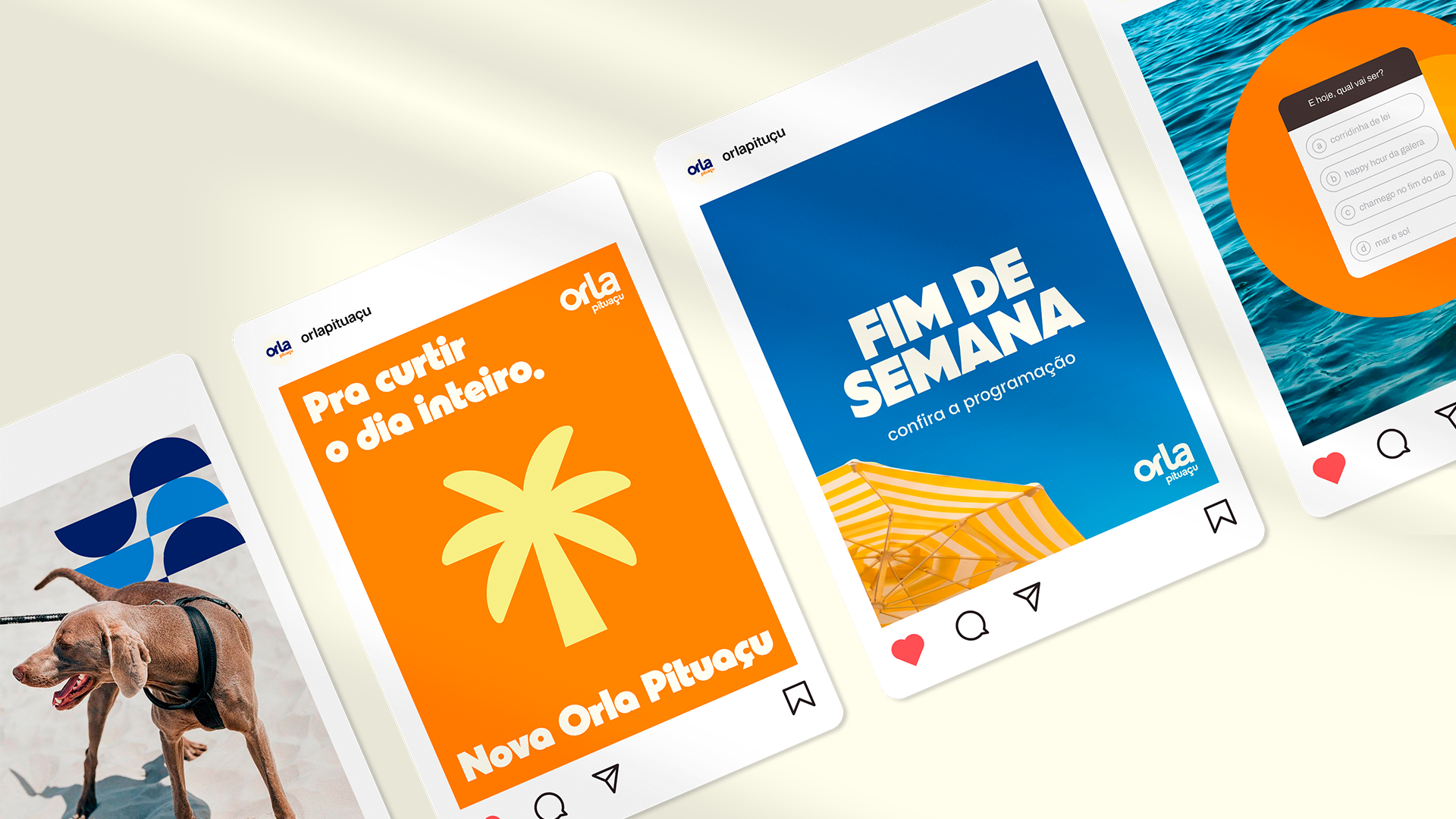
A partir de um olhar de place branding, definimos a Orla Pituaçu como um espaço estruturado, vivo e múltiplo, que acolhe diferentes ritmos, corpos e histórias. A proposta de valor combina conforto e bem-estar com pertencimento e conexão. A marca nasceu para fazer da vida ao ar livre uma escolha fácil, acessível e prazerosa.
[ENG]
The Strategy
Through a place-branding lens, Orla Pituaçu was defined as a structured, vibrant, and multifaceted destination—one that welcomes different rhythms, bodies, and stories. Its value proposition combines comfort and well-being with a strong sense of belonging and connection. The brand was created to make outdoor living an easy, accessible, and enjoyable choice.
[PT/BR]
Expressão verbal
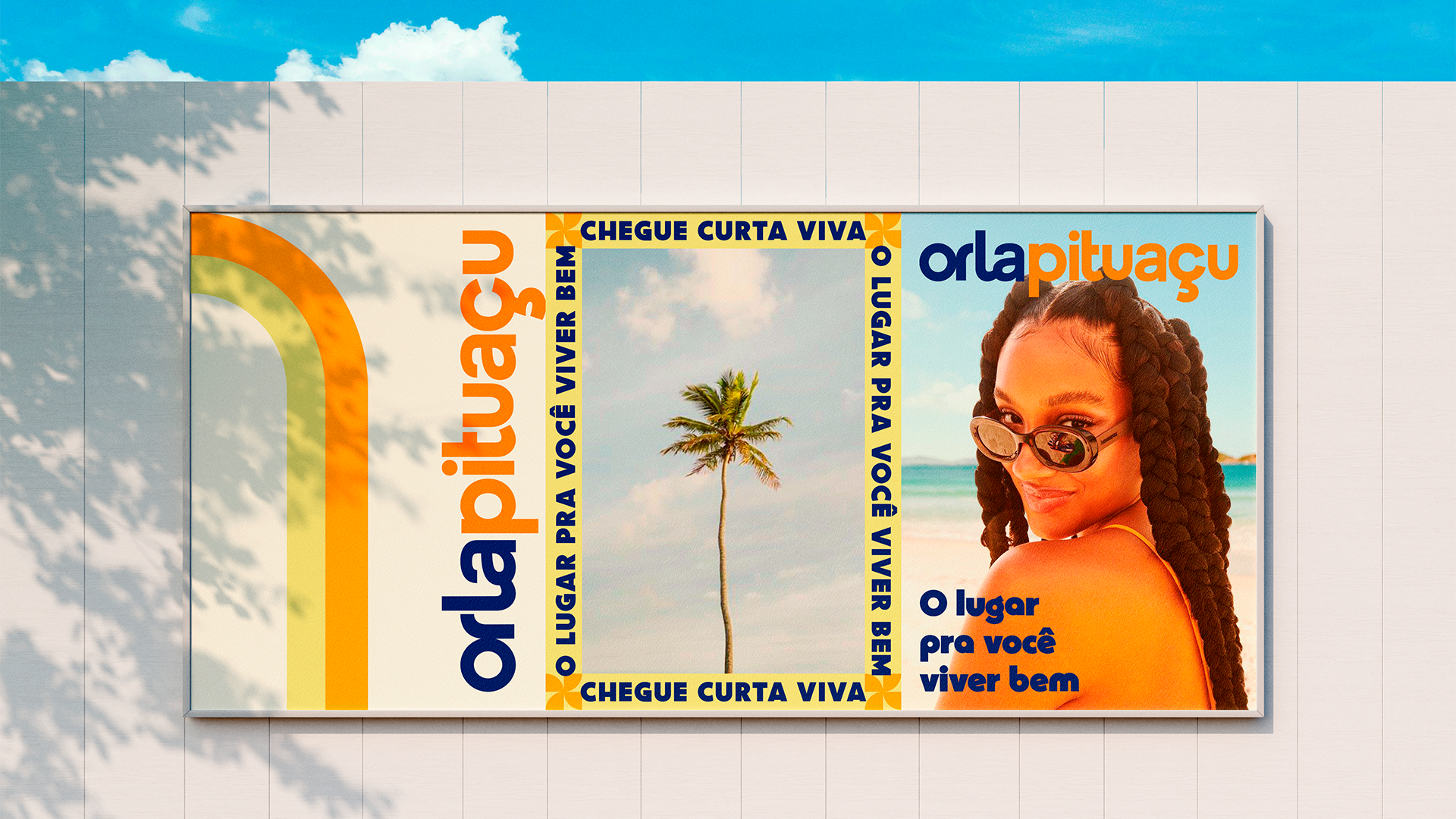
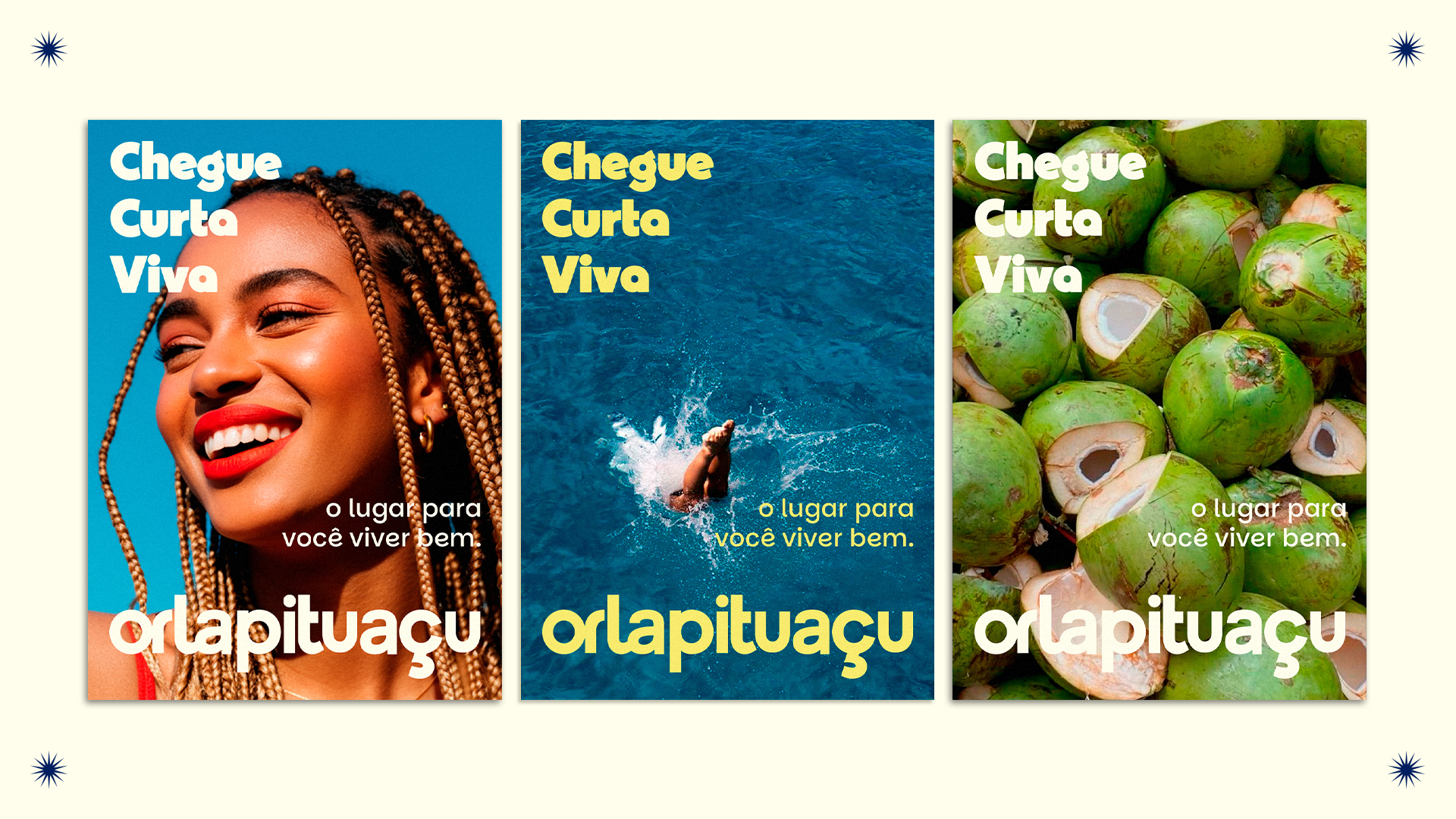
O tom de voz da Orla Pituaçu é democrático, otimista e orgulhoso. A marca fala como quem convida: mostra o lado bom de viver a cidade, valoriza o cuidado com as pessoas e celebra o orgulho de ser soteropolitano. Frases diretas e cheias de energia reforçam essa presença próxima e inspiradora, traduzindo a orla como espaço de encontro.
[ENG]
Verbal Identity
Orla Pituaçu’s tone of voice is democratic, optimistic, and proud. The brand speaks as an invitation—highlighting the joys of urban life, valuing care for people, and celebrating the pride of being from Salvador. Direct, energetic language reinforces a welcoming and inspiring presence, positioning the waterfront as a place for connection and shared experiences.
[PT/BR]
Identidade visual
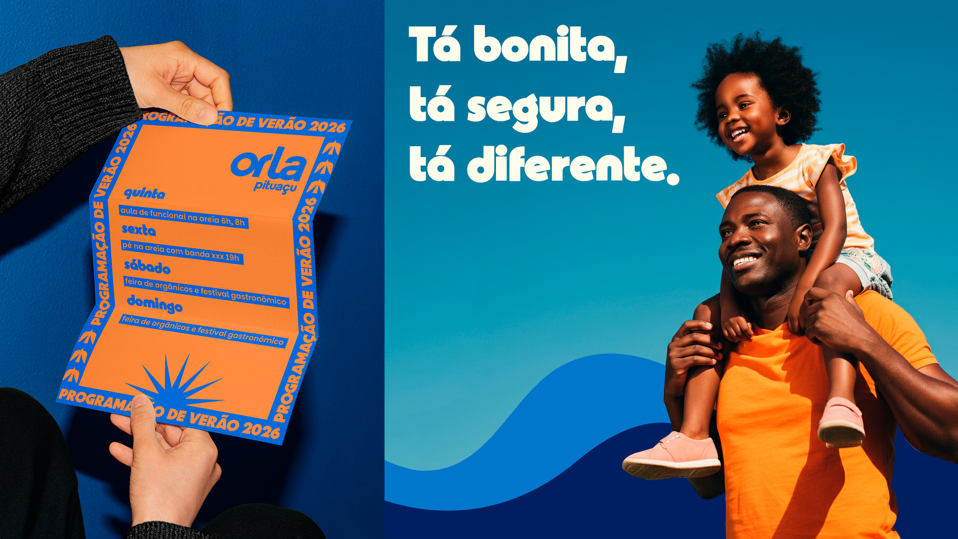
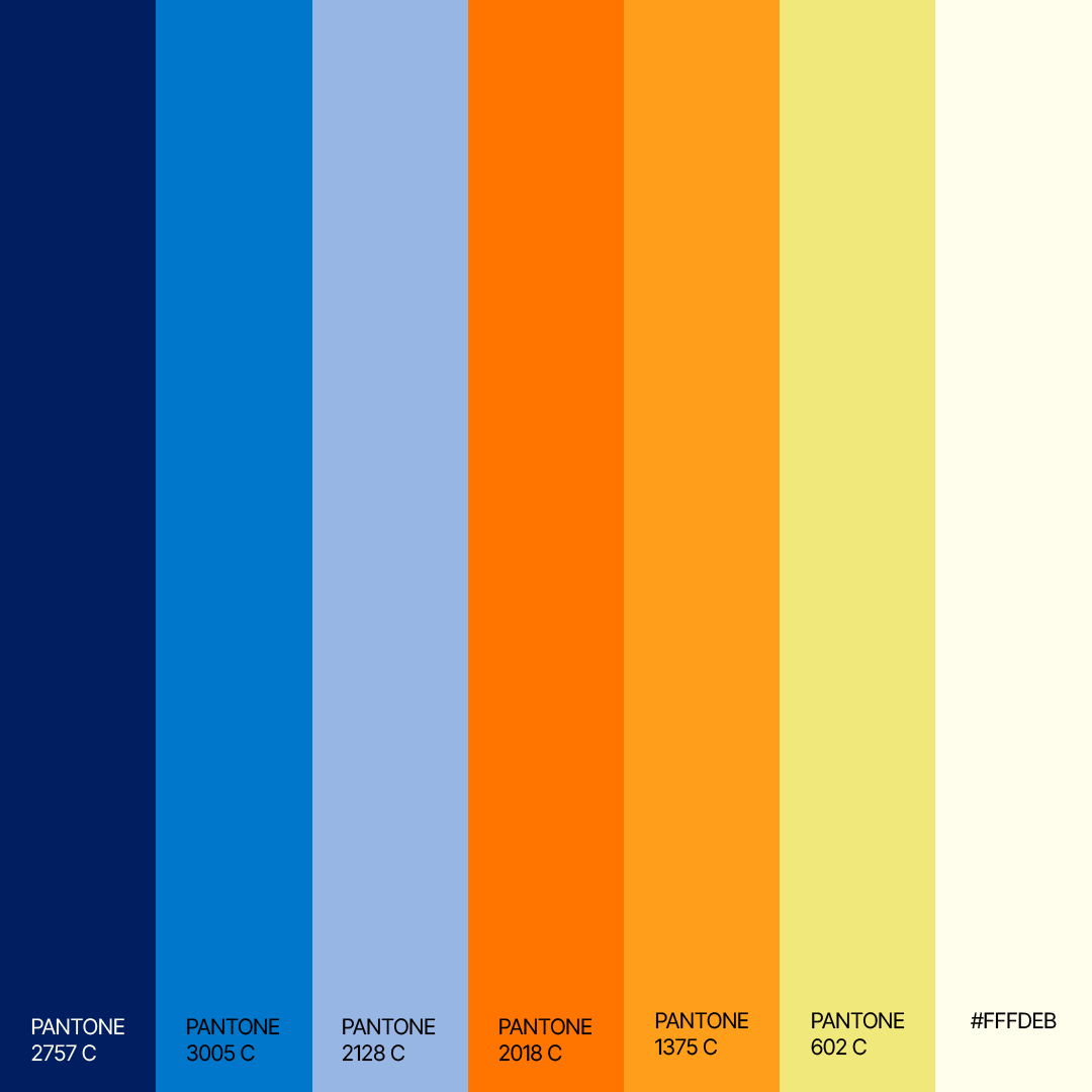
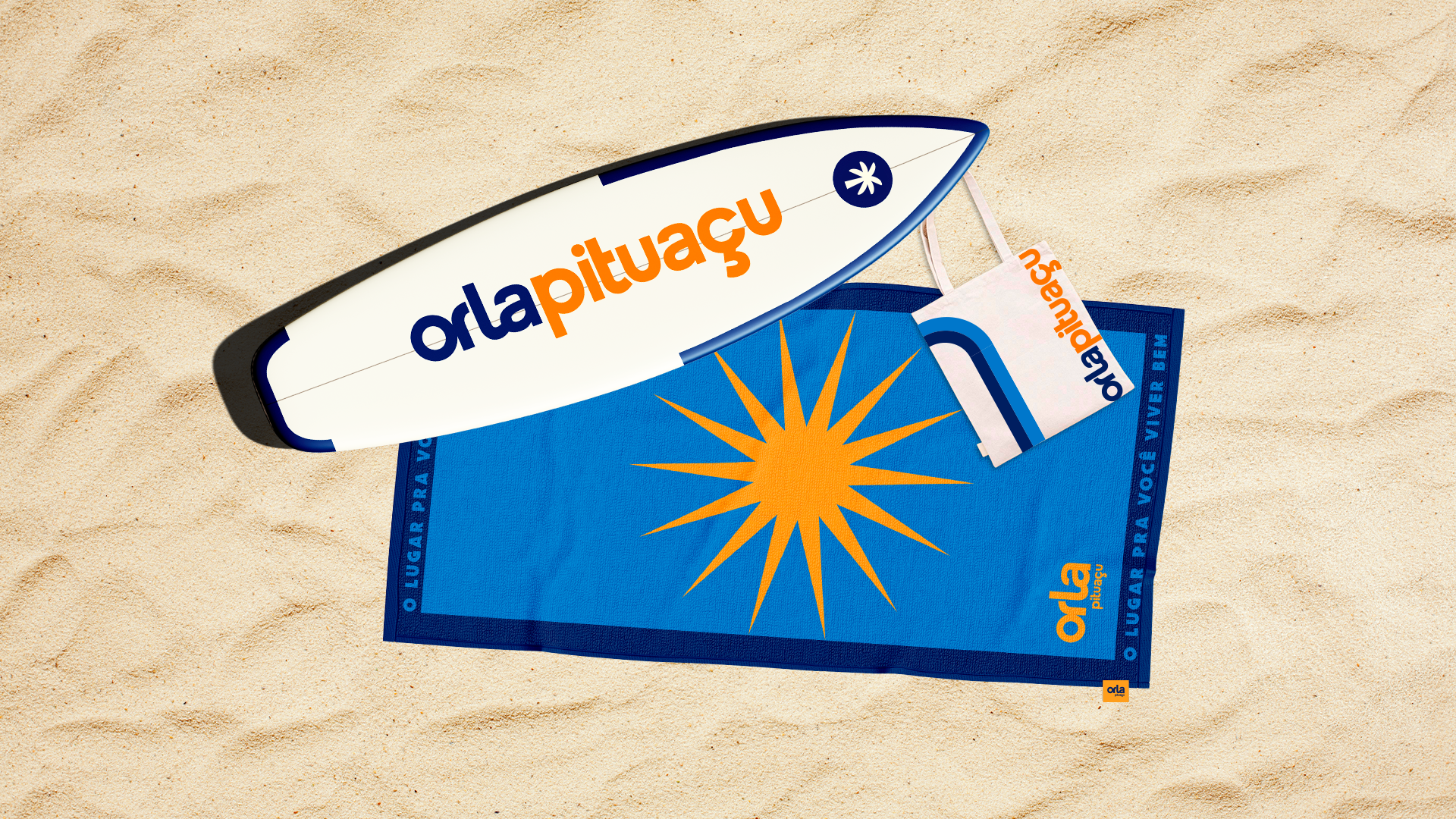
A identidade visual equilibra impacto e vivacidade. A escolha cromática mistura tons quentes e azuis vibrantes, refletindo o clima tropical, o frescor do mar e o movimento do dia que começa e termina à beira da orla.
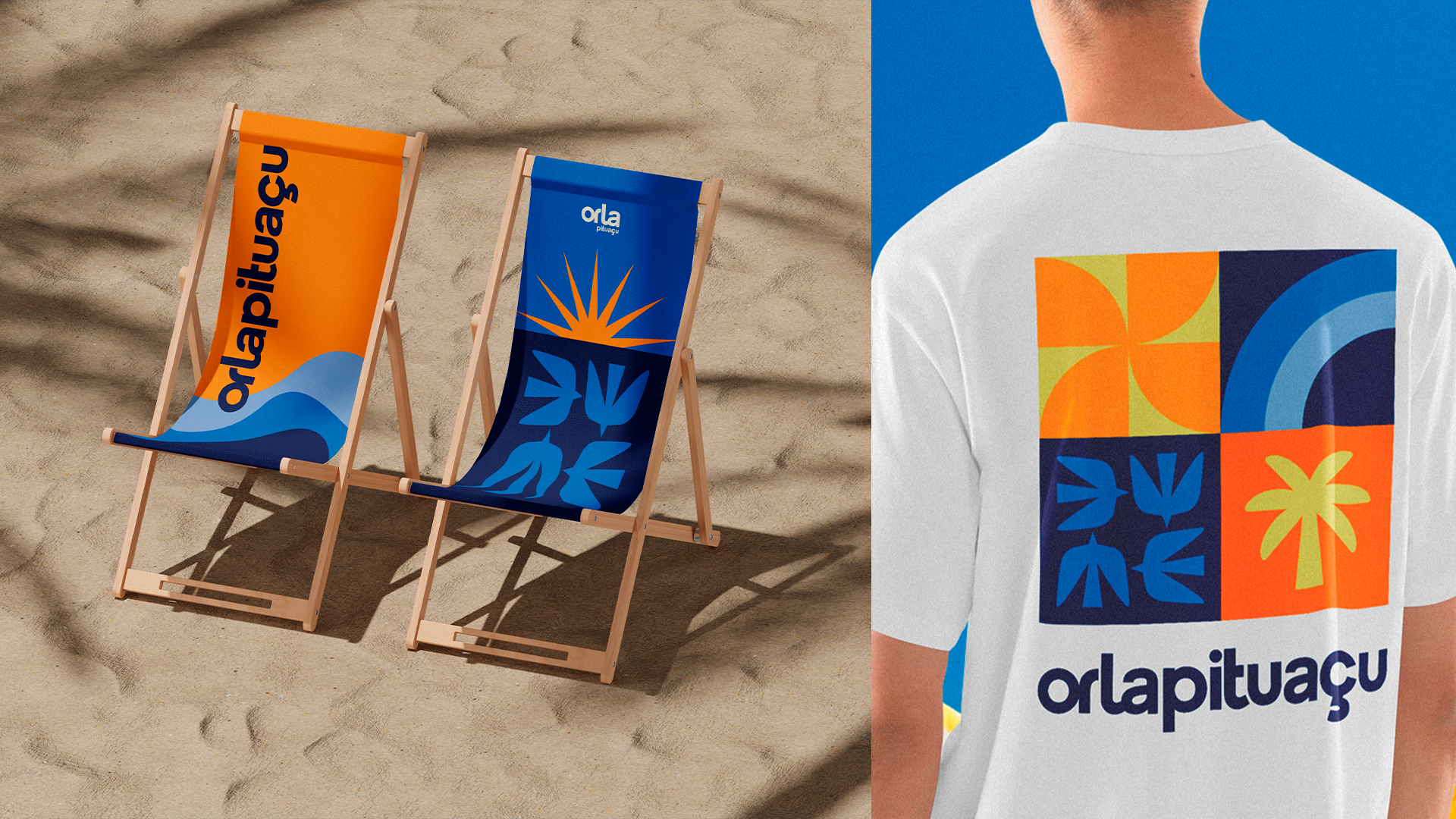
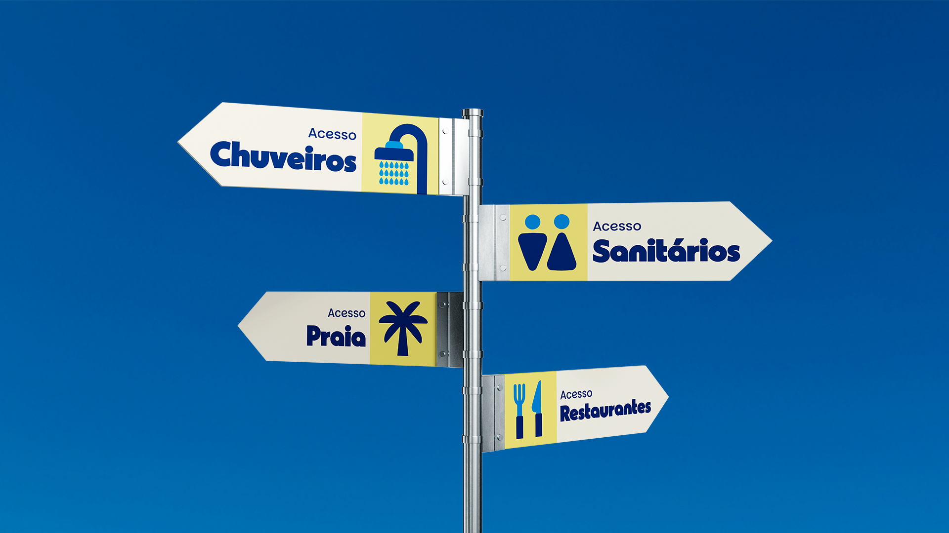
Os grafismos inspirados em ondas, formas solares e geometrias costeiras reforçam o dinamismo e o caráter lúdico da marca. O resultado é um sistema visual versátil e reconhecível, capaz de traduzir a energia de uma cidade viva, diversa e sempre em movimento.
[ENG]
Visual Identity
The visual identity balances impact and vibrancy. Its color palette combines warm tones with vivid blues, reflecting the tropical climate, the freshness of the sea, and the rhythm of days that begin and end by the waterfront.
Graphic elements inspired by waves, sun shapes, and coastal geometries reinforce the brand’s dynamic and playful character. The result is a versatile and recognizable visual system that captures the energy of a vibrant, diverse city that is always in motion.

Credits
Agency — HIKE
Client — Orla Pituaçu (Orla Brasil)
Creative Direction — Fernanda Queiroz
Art Direction — Vanessa Barreto
Verbal Expression — Fernanda Queiroz, Anna Júlia Menezes
Design — Vanessa Barreto, Isabella Peixoto, Maisa Carvalho