
LUX Botanicals | Energia de Cheirosa
Categories: Campaign - Creative Direction - Key Visual - Packaging
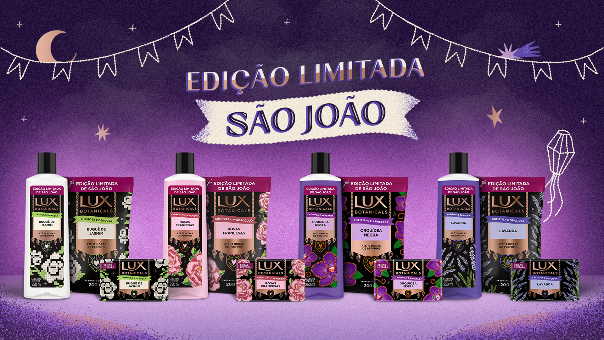
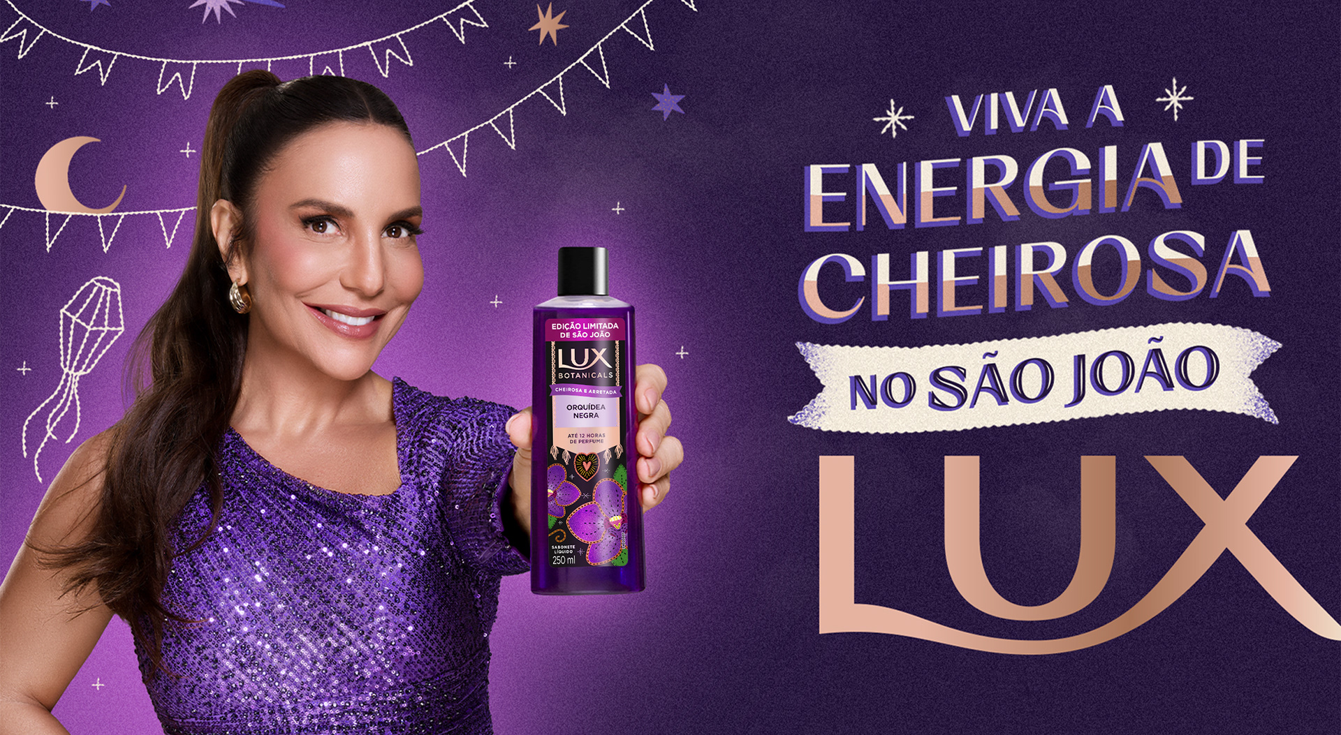
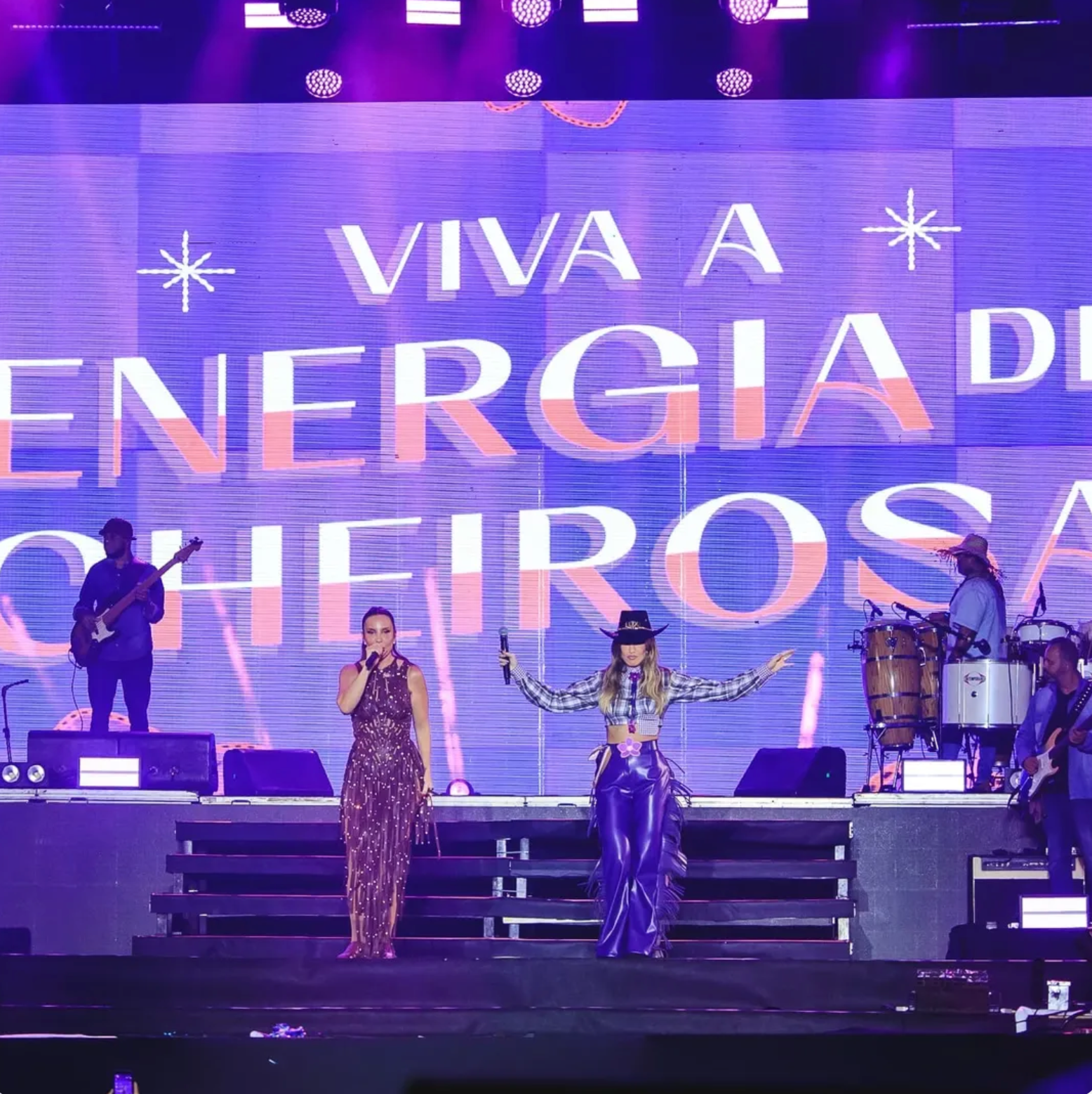
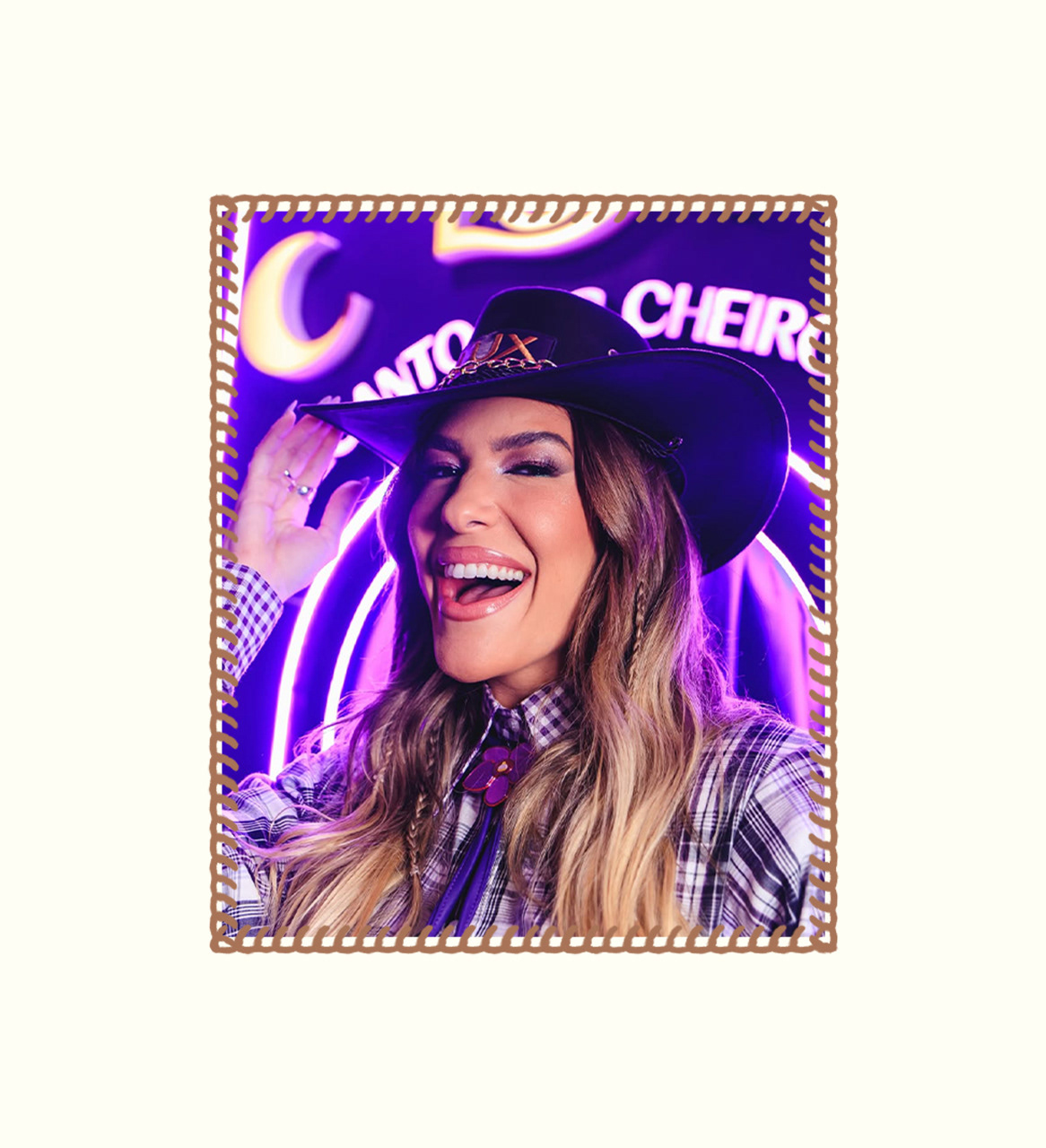
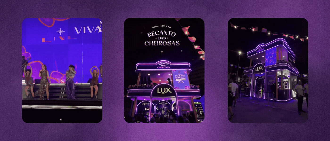
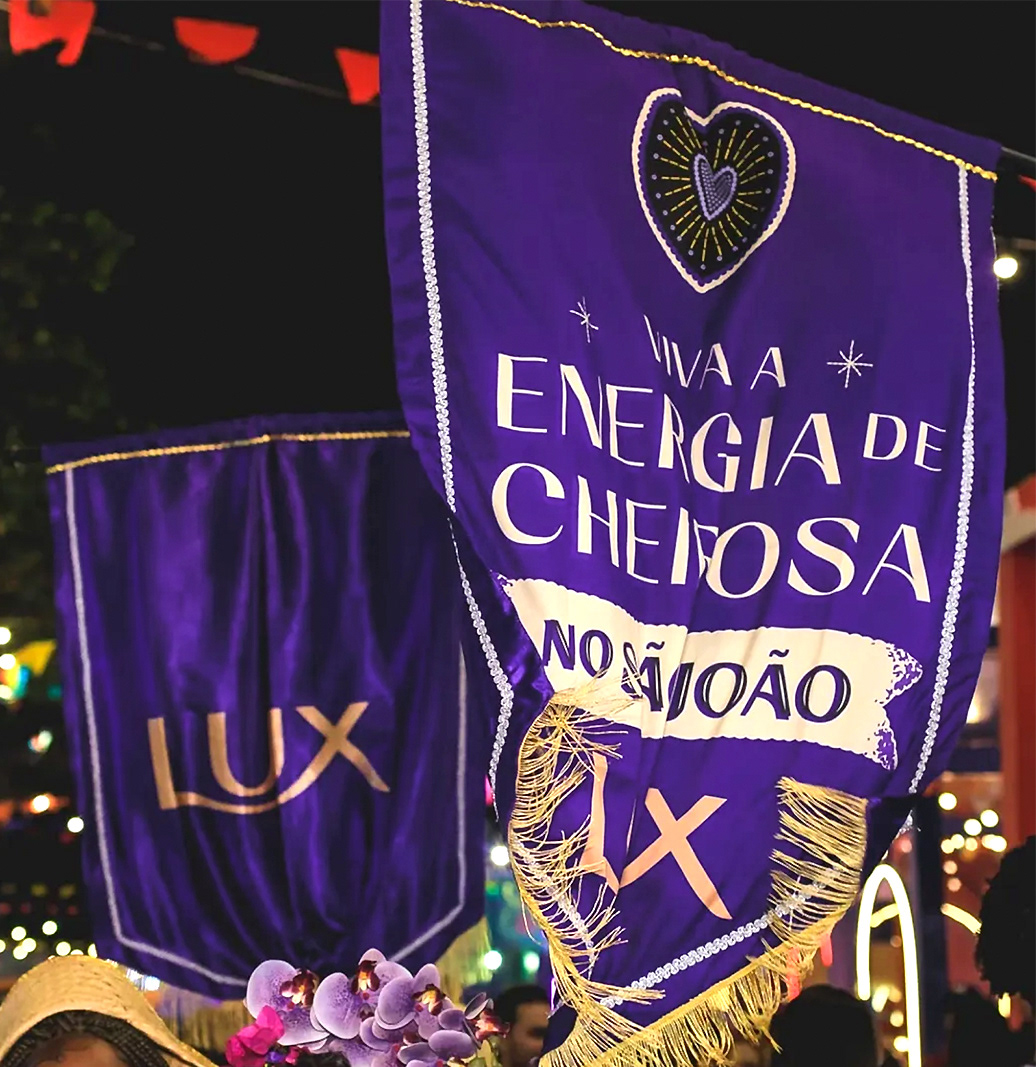
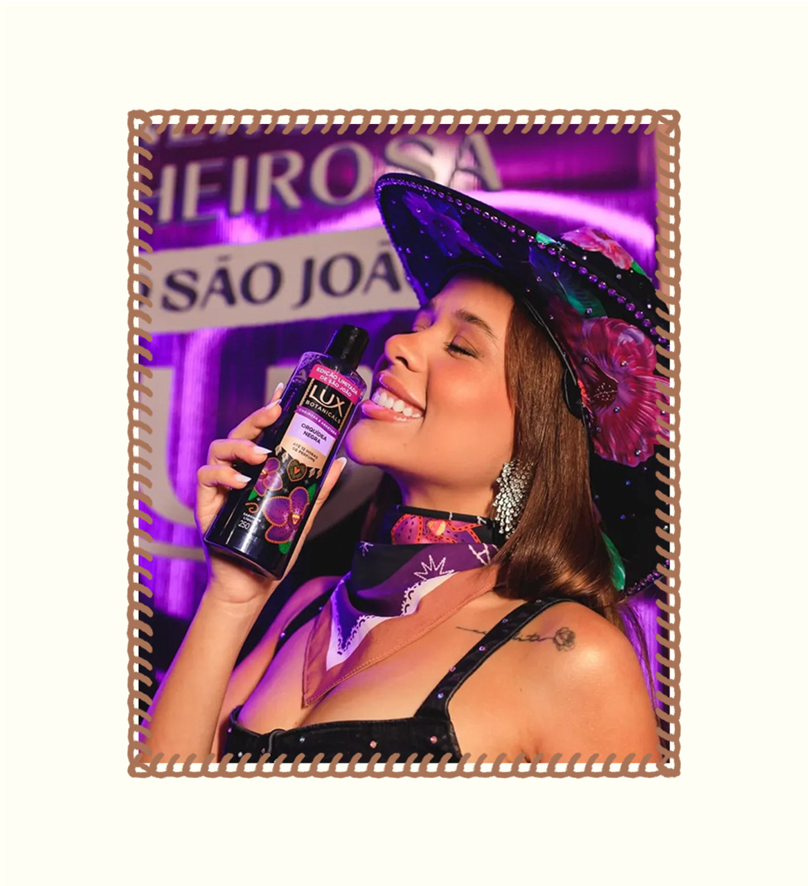
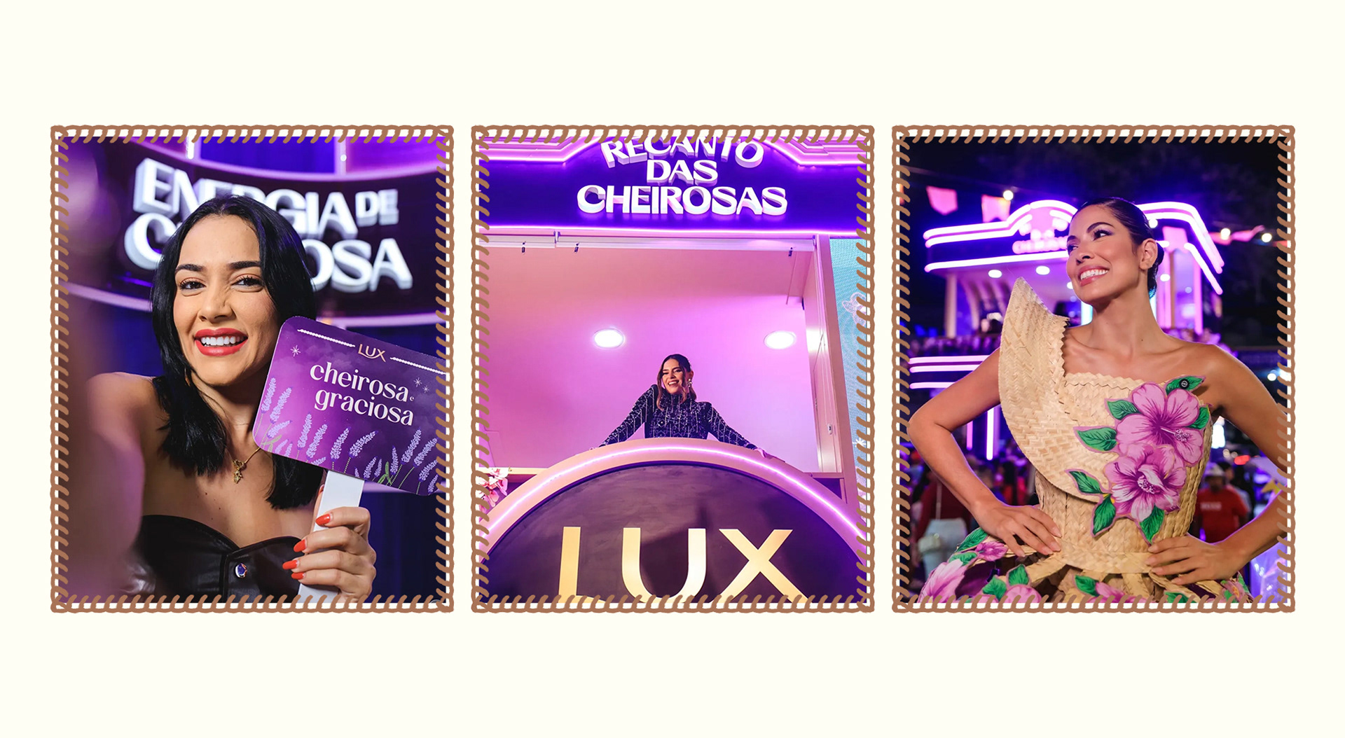
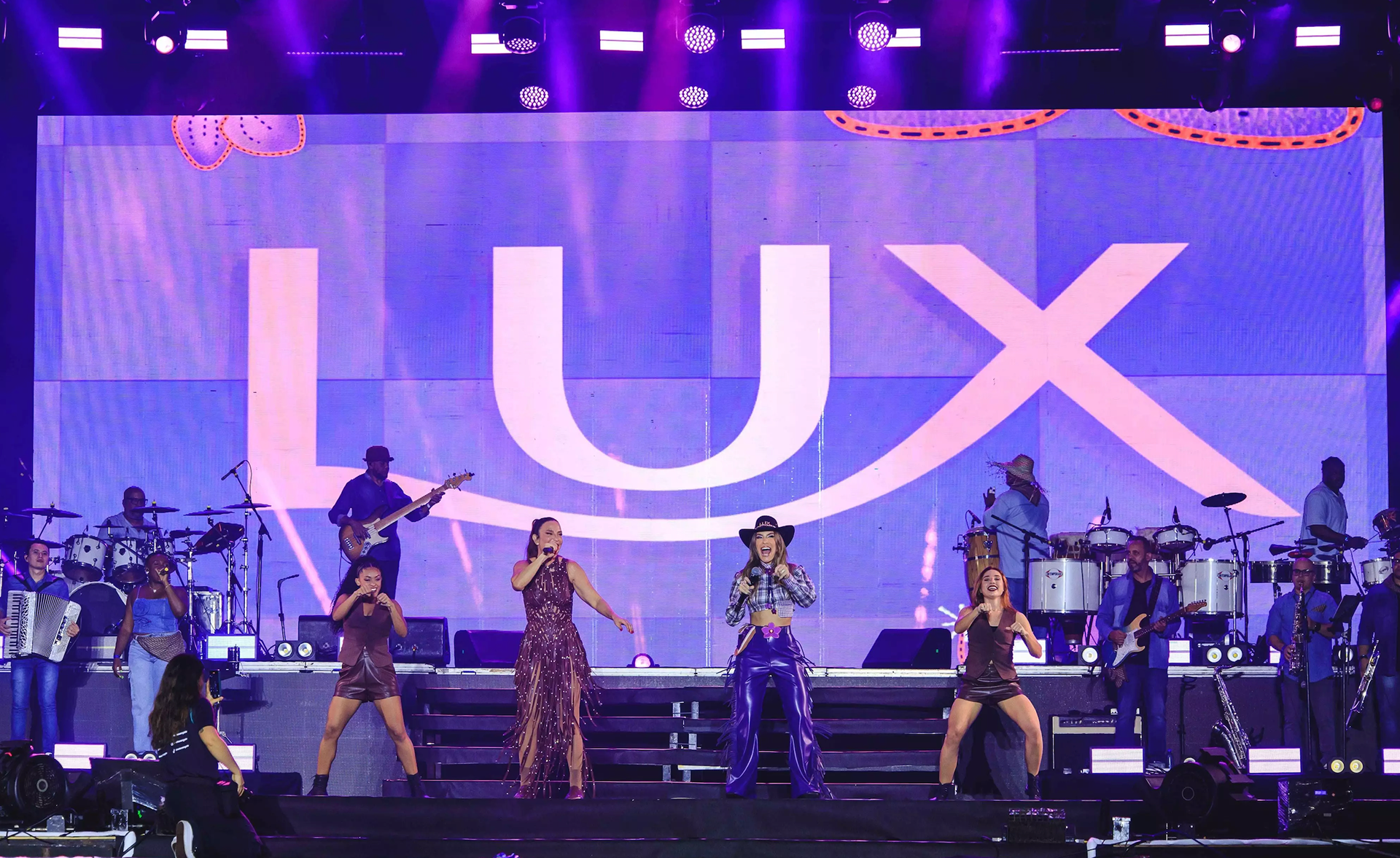
Edição Limitada de São João, 2025
[PT/BT]
A marca
Desde 1925, Lux, marca da Unilever, celebra as mulheres que se orgulham em expressar sua própria beleza. Mais do que sabonetes, Lux cria um espaço simbólico onde a feminilidade é força, expressão e liberdade. Com presença global, a marca reflete a mulher contemporânea, sofisticada, confiante e autêntica, e segue se reinventando a cada nova edição, sem perder a essência que a tornou um ícone.
[ENG]
The Brand
Since 1925, Lux, a Unilever brand, has celebrated women who embrace and express their own beauty. More than a beauty soap brand, Lux creates a symbolic space where femininity becomes strength, self-expression, and freedom. With a global presence, Lux reflects the contemporary woman: sophisticated, confident, authentic, and ever-evolving. While continuously reinventing itself, the brand remains true to the essence that has made it an icon for generations.
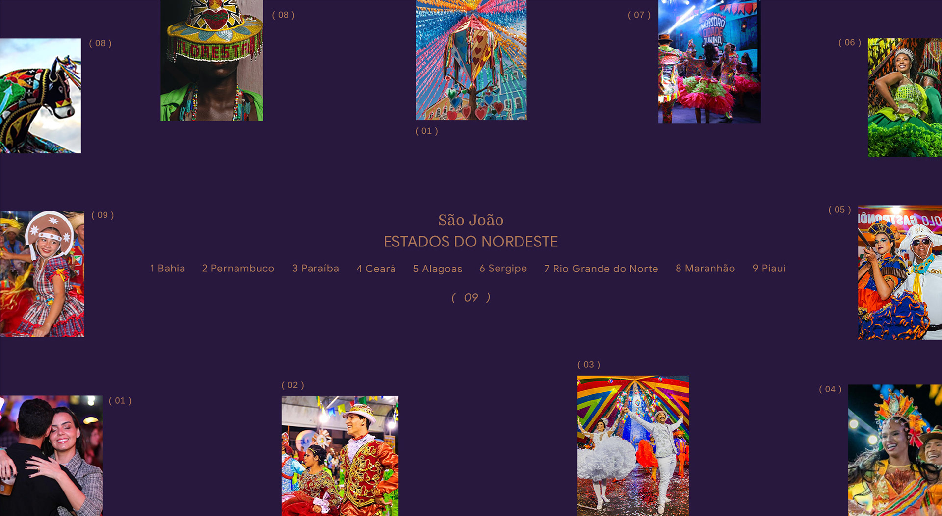
Foto reprodução: Instagram dos Estados, Pinterest.
[PT/BR]
Desafio
Traduzir o espírito do São João sem recorrer a clichês visuais ou estereótipos culturais.
O desafio foi equilibrar tradição e contemporaneidade, unindo a identidade elegante de Lux à riqueza cultural do Nordeste brasileiro, em uma celebração que fosse autêntica, plural e sensorial.
Era preciso criar uma embalagem especial que dialogasse com a campanha nacional da marca, mantivesse o reconhecimento de Lux nas prateleiras e, ao mesmo tempo, honrasse a diversidade das festas nordestinas considerando suas estéticas, aromas, ritmos e mulheres.
[ENG]
The Challenge
To capture the spirit of São João without relying on visual clichés or cultural stereotypes.
São João is one of Brazil’s most celebrated cultural festivals, particularly in the Northeast, where music, dance, food, craftsmanship, and community traditions come together in a vibrant seasonal celebration.
The challenge was to balance heritage and contemporaneity, bringing together Lux’s refined visual identity and the cultural richness of Northeastern Brazil in a way that felt authentic, sensory, and culturally respectful.
The packaging needed to connect with the brand’s nationwide campaign, preserve Lux’s strong shelf recognition, and celebrate the diversity of Northeastern festivities through their aesthetics, aromas, rhythms, and the women who keep these traditions alive.
[PT/BR]
Contexto e Estratégia
A pesquisa partiu de uma imersão profunda nas 9 regiões do Nordeste, valorizando tanto suas diferenças quanto seus pontos em comum.
Comidas típicas, danças, músicas, vestimentas e formas de expressão variam de estado para estado — mas a fogueira, o milho, a cor e o sentimento de pertencimento unem toda a região em torno de uma mesma celebração: a festa que é patrimônio cultural e afetivo.
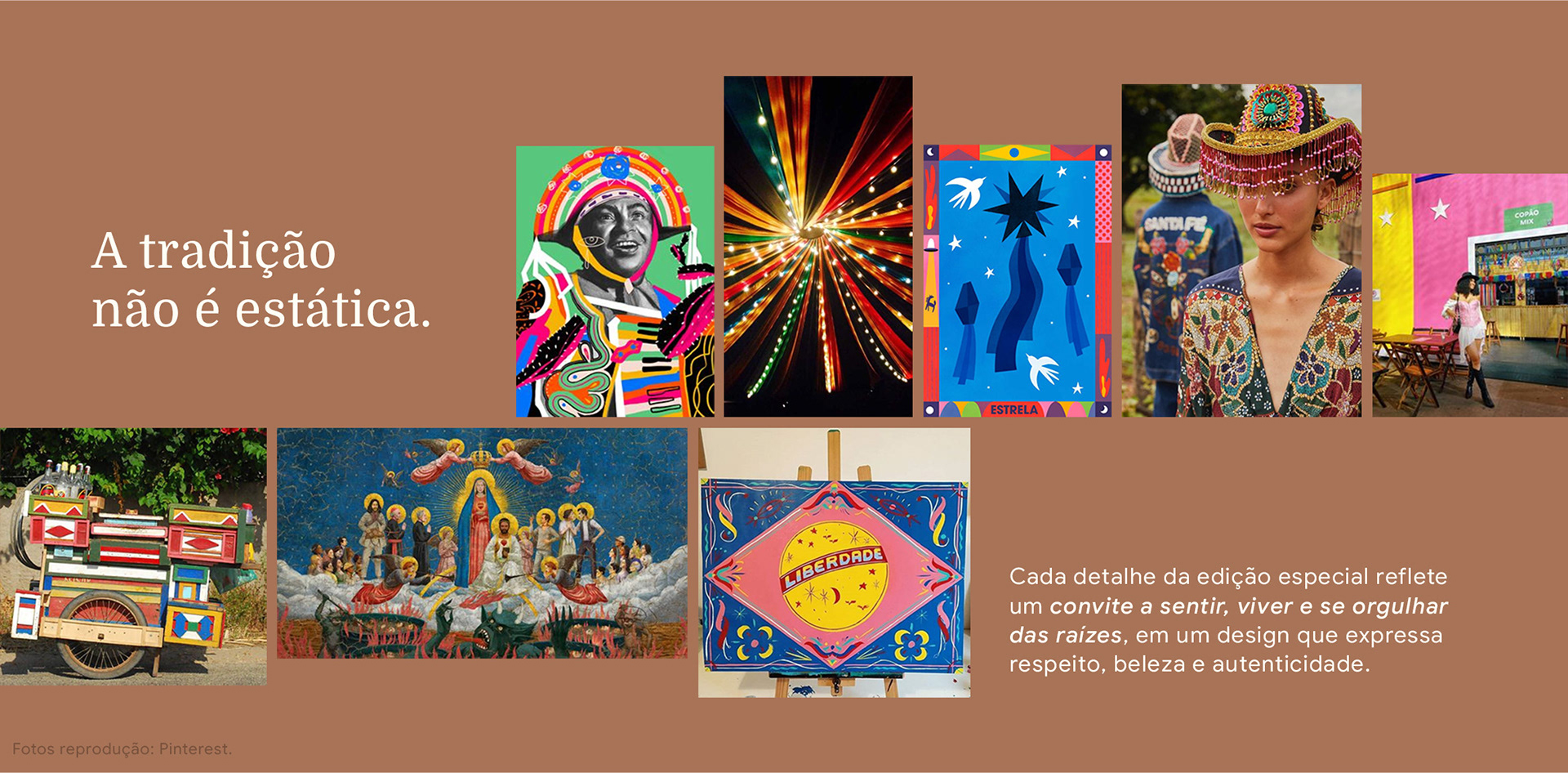
A partir desse entendimento, a estratégia criativa se baseou em um princípio essencial:
[ENG]
Context & Strategy
The project began with an immersive research process across the nine states of Northeastern Brazil, exploring both their unique characteristics and the cultural threads that unite them.
Traditional foods, music, dances, clothing, and forms of expression vary from state to state. Yet elements such as the bonfire, the corn harvest, vibrant colors, and a deep sense of belonging connect the entire region through the same celebration, a festival that represents both cultural heritage and collective memory.
From this understanding emerged a central strategic principle: Tradition is not static. Every detail of this edition is designed as an invitation to experience, celebrate, and reconnect with cultural roots, through a visual language that embodies authenticity, craftsmanship, and respect for tradition.
[PT/BR]
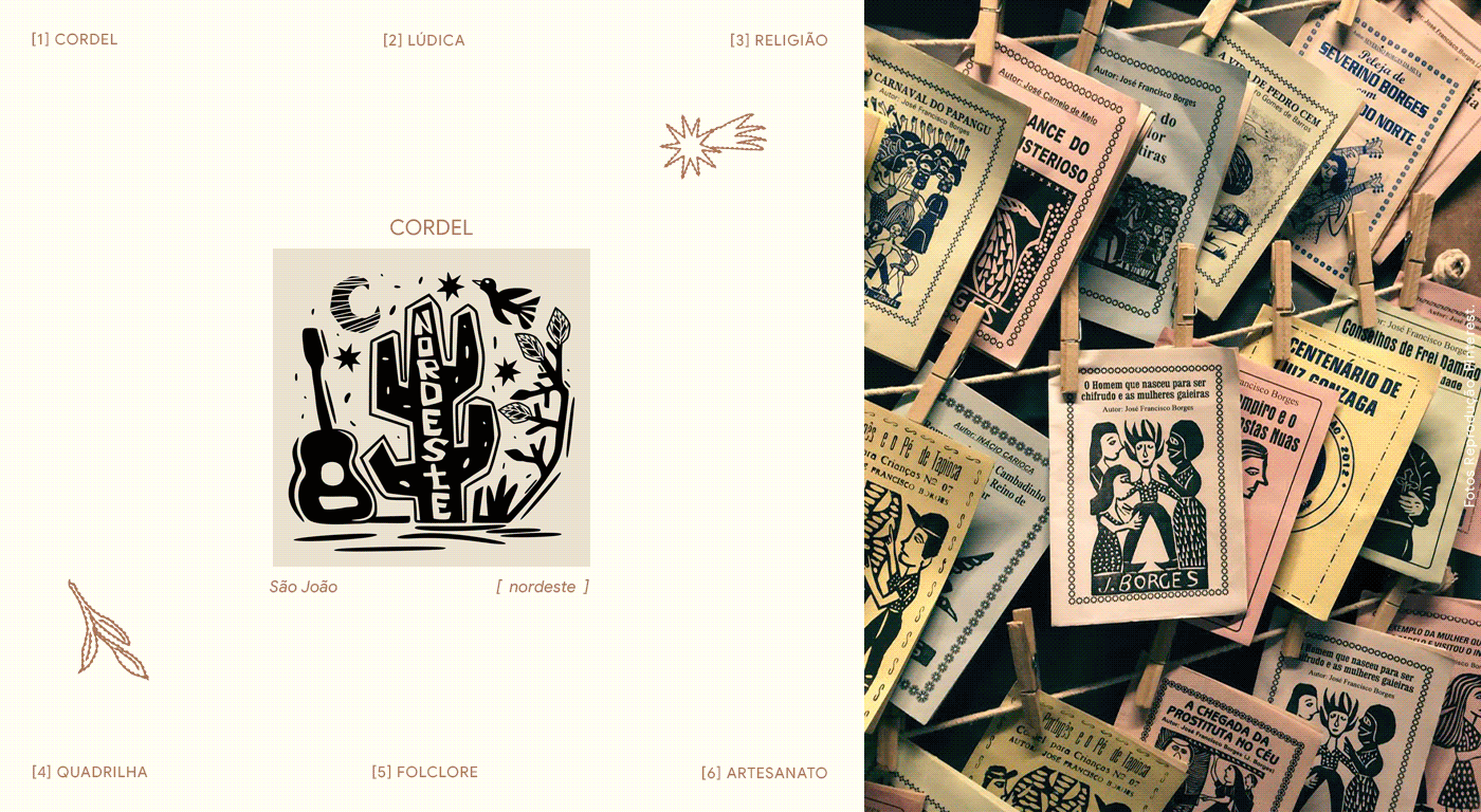
Conceito e Verbal
A edição especial celebra "A Beleza da Festa" e a força das mulheres nordestinas.
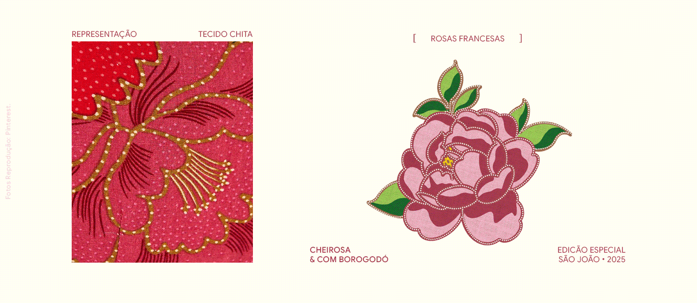
De ponto em ponto, de conto em conto, a identidade se constrói a partir de histórias contadas a várias mãos — na chita, no bordado, na renda e no couro — símbolos de pertencimento, memória e expressão.
No coração da narrativa, um manifesto que traduz o espírito da coleção:
[ENG]
Concept & Narrative
This special edition celebrates "The Beauty of the Festival" and honors the strength, creativity, and cultural legacy of Northeastern Brazilian women.
Stitch by stitch, story by story, identity is woven through traditions passed down across generations. Chita fabrics, embroidery, lacework, and leather craftsmanship become visual symbols of belonging, memory, and self-expression.
At the heart of the project lies a manifesto that captures the spirit of the collection:
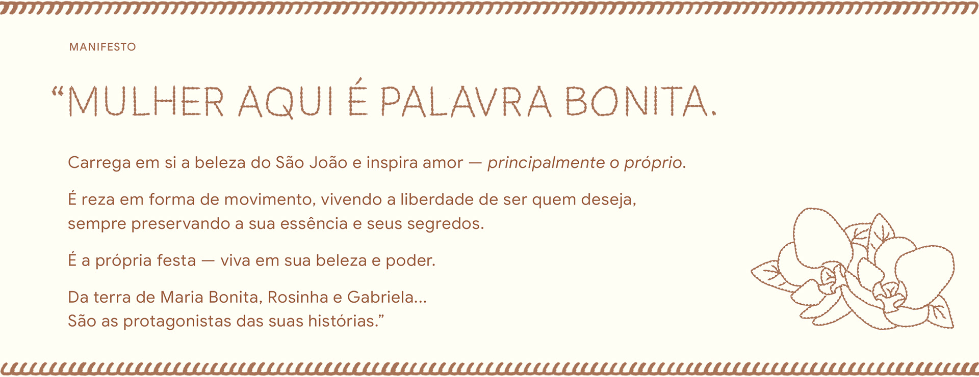
Manifesto
"WOMAN HERE IS A BEAUTIFUL WORD."
It embodies the beauty of São João and inspires love, especially self-love.
It is prayer in the form of movement, experiencing the freedom to be who you want to be, always preserving your essence and your secrets.
It is the very essence of celebration, alive in its beauty and power.
From the land of Maria Bonita, Rosinha, and Gabriela...
They are the protagonists of their own stories.
[PT/BR]
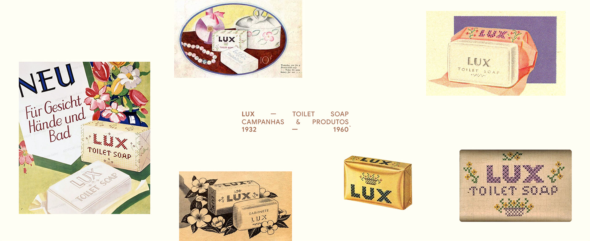
Elementos visuais que atravessam o tempo
Em 1932, chegava ao Brasil os sabonetes de Lux, ainda em se chamava sabonete Lever, sendo criação dos irmãos Lever. Desde 1991 a Lux se mantém no topo da lembrança dos brasileiros, levando o prêmio Top of Mind há 35 anos consecutivos, estando presente no banheiro de 70% dos lares brasileiros.
As embalagens históricas da marca possuíam elementos ornamentais e composições florais inspirados no bordado artesanal, especialmente no ponto cruz.
[ENG]
Visual elements that transcend time
Lux arrived in Brazil in 1932, originally introduced as Lever Soap, a creation of the Lever brothers. Since 1991, the brand has remained one of the most recognized names in the country, earning the Top of Mind award for 35 consecutive years and becoming part of the daily routine of 70% of Brazilian households.
Throughout its history, Lux packaging has featured ornamental details and floral compositions inspired by handcrafted embroidery traditions, particularly cross-stitch patterns. These visual codes became an important part of the brand’s aesthetic heritage and served as a starting point for the development of this special edition.
[PT/BR]
Visual e Embalagem
A tradução visual da edição especial mergulha nos materiais, texturas e cores que compõem o imaginário das festas juninas nordestinas — reinterpretados sob a lente da sofisticação e do toque artesanal característico de Lux.
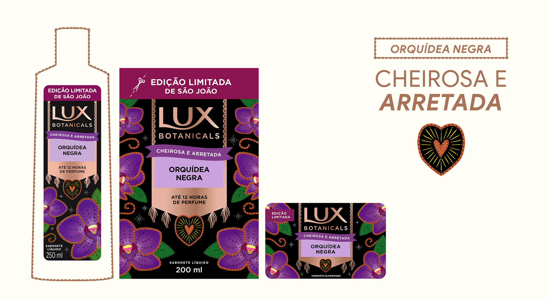
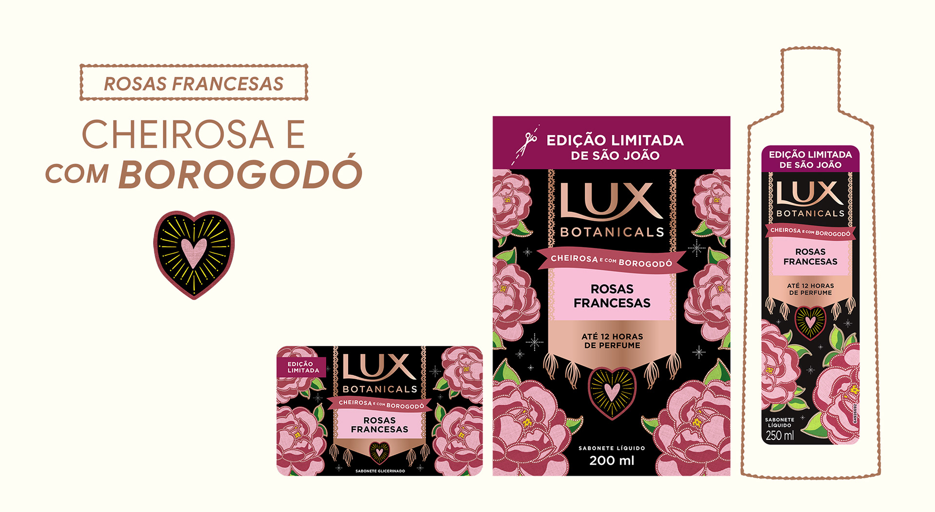
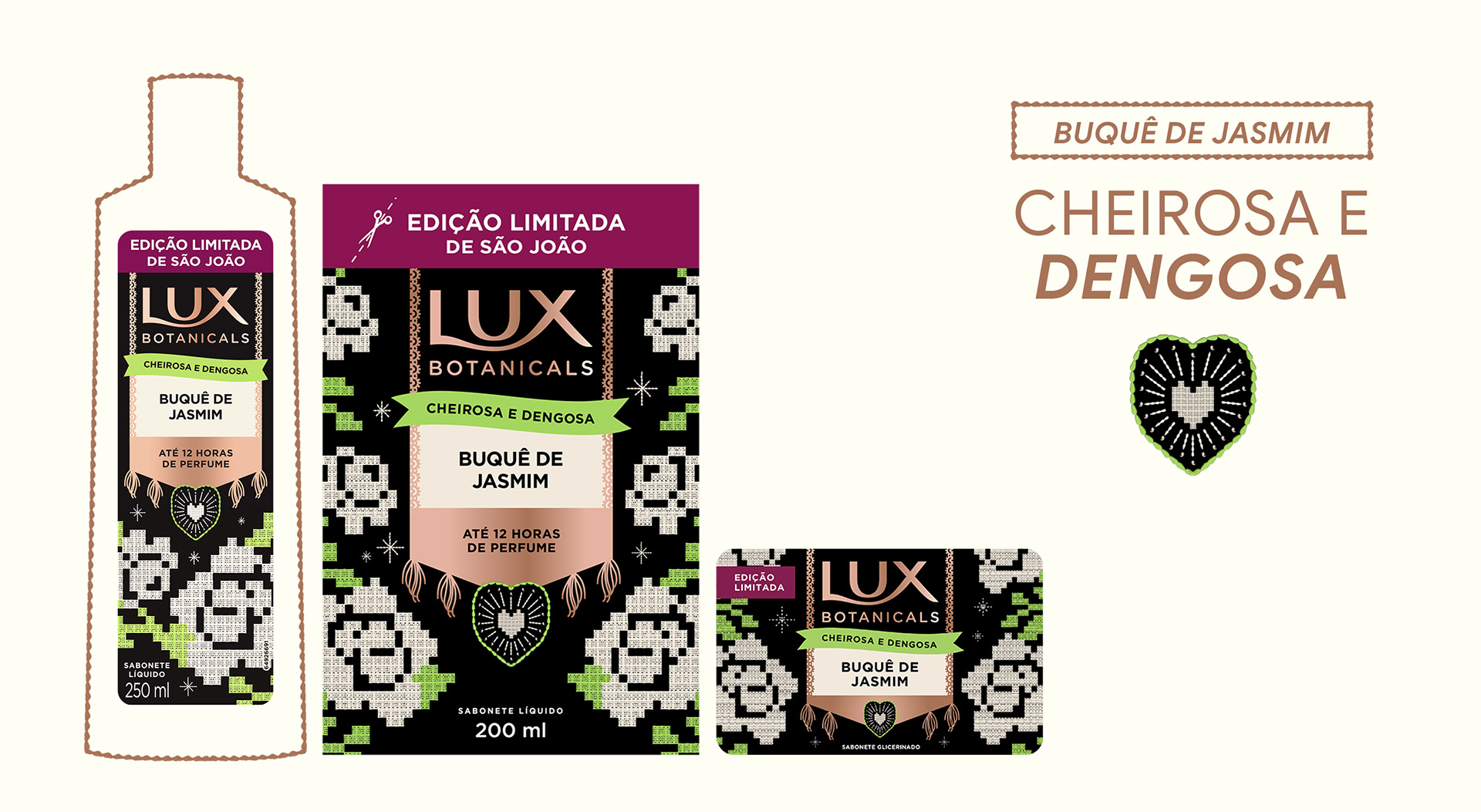
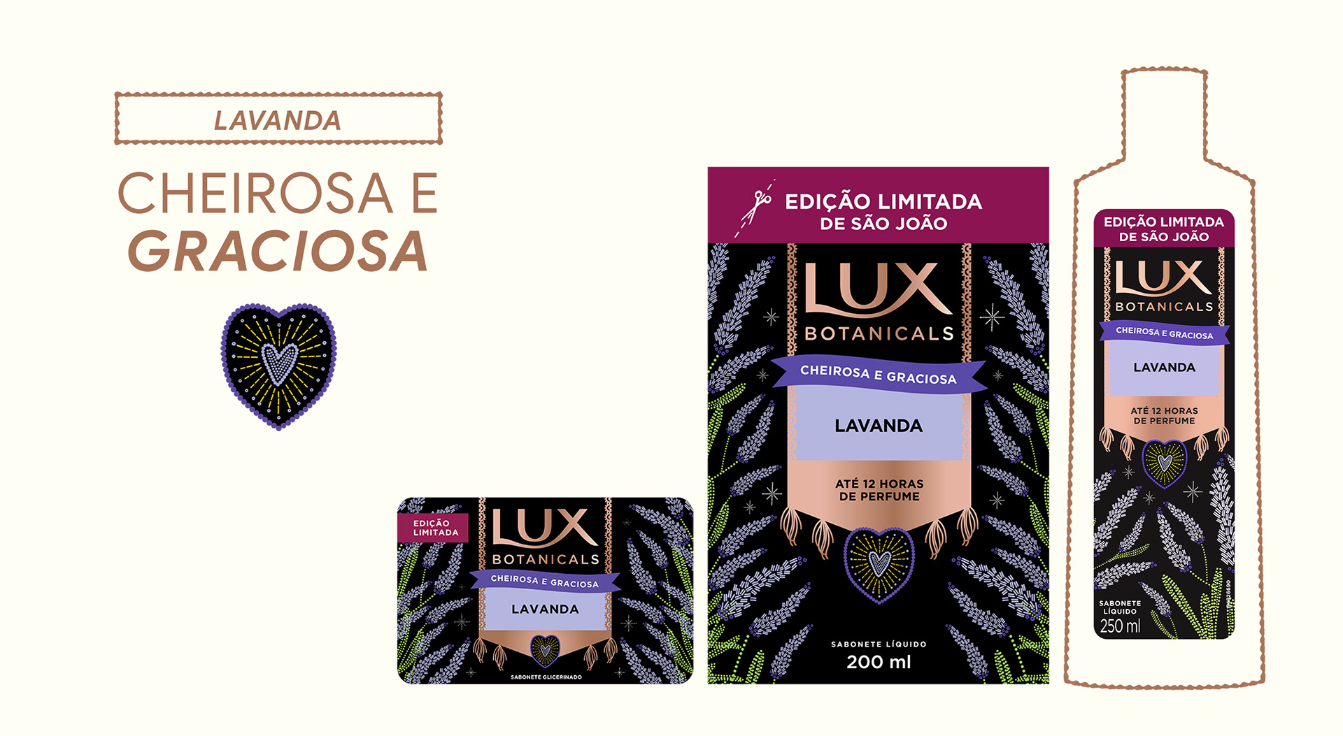
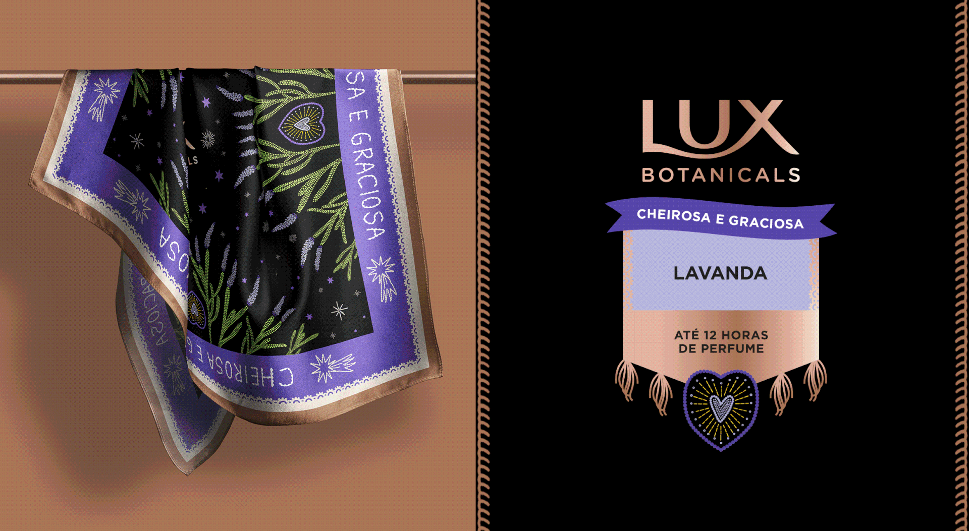
Cada fragrância ganha uma linguagem visual própria, inspirada em uma técnica artesanal tradicional e em um arquétipo feminino.
O resultado é uma coleção que transforma o São João em arte e design, exaltando o orgulho das raízes e o poder da mulher nordestina — protagonista, cheirosa e cheia de histórias para contar.
[ENG]
Visual Language & Packaging Design
The visual system developed for this collection draws inspiration from the materials, textures, and colors that shape the imagery of Northeastern Brazil’s June festivals. Traditional references were reinterpreted through a contemporary lens, combining sophistication with the artisanal character that has long been associated with the Lux universe.
Each fragrance was given its own visual identity, inspired by a traditional craft technique and a distinct feminine archetype.
The result is a collection that transforms São João into an expression of art and design, celebrating cultural roots and highlighting the strength, beauty, and the stories of Northeastern Brazilian women, protagonists of their own journeys, carrying beauty, strength, and generations of stories within them.
[PT/BR]
As protagonistas
A partir da observação dos arquétipos femininos presentes na cultura popular e na literatura nordestina, estabelecemos um paralelo entre a mulher Lux e a mulher nordestina — ambas fortes, determinadas e cheirosas.
Cada fragrância representa uma dessas protagonistas e suas múltiplas formas de beleza.
[ENG]
The Protagonists
Inspired by feminine archetypes found in popular culture and Northeastern Brazilian literature, the project establishes a connection between the Lux woman and the Northeastern Brazilian woman.
Both embody resilience, confidence, sensitivity, and presence. Both carry stories, traditions, and identities that transcend generations.
Each fragrance represents one of these protagonists, revealing a different expression of beauty and femininity.
Credits
Agency – HIKE
Client – LUX Botanicals (Unilever)
Project Management – Alice Moura
Creative Direction – Fernanda Queiroz
Art Direction – Vanessa Barreto
Strategy & Verbal Identity – Juliana Castro
Design – Vanessa Barreto, Isabella Peixoto, Maisa Carvalho
Packaging Design – Isabella Peixoto
Motion Case – Ribeiro Creative, Aleck Santos
Photography & Video Assets – Instagram Oficial Lux Brasil®